
TWO colours were announced this year!
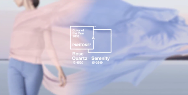
Rose Quartz (Pantone 13-1520) and Serenity (Pantone 15-3919)
Interestingly, this is the first year Pantone has selected 2 colours, and both colours offer a host of possibilities in the cosmetics world. I can imagine a gorgeous blush palette with various Rose Quartz-ish shades, and Serenity would make beautiful eye and nail products. 😀 In one of my TBT posts, I guessed that Pantone might choose either a yellow or a blue. I got 50% right! 😛
Read more from Pantone and WWD.
What are your thoughts about the 2016 Pantone colours of the year?

Franky, I’m a little disappointment with the pantone colors of 2016. It’s still too early to tell if I’ll like these baby-hued pink and blue. I agree with you on the nail products. A pink and blue nail polish would be something I look forward to. .
LikeLiked by 1 person
I agree, they’re a bit uninspiring. Serenity is similar to Cerulean Blue that was the colour of the year in 2000. With ALL the possible colours under the rainbow, they chose this particular hue? I hope that Sephora will interpret the colours into pretty cosmetics!
LikeLiked by 1 person
Fingers and legs crossed!
LikeLiked by 1 person
I am loving both right now! The pictures that I have seen pairing them together looks great but I think I will gravitate more towards the Rose Quartz
LikeLiked by 1 person
Yes for sure Rose Quartz is the better colour out of the 2. It could possibly lead to some awesome rose gold type of colours! 😀
LikeLike
I didn’t even think about that! That is something I could look forward too!
LikeLiked by 1 person
Ha! I knew they’d do blue! But two colors, huh? Not sure I like that 😀
I probably prefer Rose Quartz as a makeup color, but Serenity as a nail color. Pastels, gah!
LikeLiked by 1 person
Maybe they’ll get the formula right! Have some faith! 😋
LikeLiked by 1 person
I can’t wait to get my hands on the products they are going to release at sephora!!!!😄😄😄😄😄😄I think they chose great colors!😍😍😍
LikeLiked by 1 person
I’m probably going to get SOMETHING but it depends on what they release. I really hope there’s a blush palette! 😁
LikeLiked by 1 person
Check the sephora website ! They have the items there already they are just not in stock yet! 🙂
LikeLiked by 1 person
Ooooh! Pretty! Why are there so many lipgloss colours? And blue lipstick… hrmmm.
LikeLiked by 1 person
It’s a sign !.. u need a blue lipstick !😜😜😜😜😜😜😜😜 idk!! I don’t care much for the glosses I’m more interested in the palette !😍
LikeLiked by 1 person
“need” and blue lipstick don’t usually end up in the same sentence! 😛
LikeLiked by 1 person
Lol!!!! They do in my book!!!😄😄😄😄😄😄😄😄😄😄
LikeLiked by 1 person
Got to love some pastels! Not the most original picks though compared to the truly impacting last year’s Marsala!… 😒xx, Annie | Annie’s Beauty
LikeLiked by 1 person
Yes I think Marsala was one of the best in recent years!
LikeLiked by 1 person
I’m so confused. Are they still calling this THE color of the year? Can you really have two color of the year…shades…It’s a little strange.
I’m not wild about either of these shades but I’ve been a huge fan of the last three shades they’ve done so I guess it was time for a “meh” shade for me. It will be interesting to see how the cosmetics world interprets these shades!
LikeLiked by 1 person
Yeah it seems they’re sticking to calling it “THE” colour of the year. Those cheaters. Well, they are THE colour authority so I guess what they say goes. I wonder how they established themselves as the colour authority. Say if some other organization starts their own colour forecasting services – they could challenge Pantone, right?
LikeLiked by 1 person
In theory they could but I feel like Pantone might make the new company some sort of “offer they can’t refuse” or something.
LikeLiked by 1 person
Totally not my cup of tea !!! Looks cute but way too “pastelliiiii” 😛
LikeLiked by 1 person
Then you can save your money when Sephora releases their collections! 😛
LikeLiked by 1 person
Girlfriend, the low buy will stop me from buying on impulse and stuff I really don’t want !!! Like this future Sephora Pantone Collection 😀
LikeLiked by 1 person
Too much pastel for me. But hopefully the rose quartz will inspire some interesting rose-toned make-up.
LikeLiked by 1 person
Yes, all I can think about is rose gold toned makeup! 😀
LikeLiked by 1 person
That would be AWESOME! 🙂
LikeLiked by 1 person
Together it’s too much pastel for me, but on their own each is nice. I’m more of a fan of the deeper colours, but since the colour of the year has been a deep colour for so many years, I suppose they’re due for a pastel.
LikeLiked by 1 person
Yesssssssss now these are colors I can work with in Winter and Spring! I have a nail polish from wet n wild that will match that blue perfectly.
LikeLiked by 1 person
They’re both kind of cool toned shades too – right up your alley!
LikeLiked by 1 person
I was so surprised when they said they had two colours, especially with the pink! But I totally called the ‘powder blue” blue! 😛 It kinda of just reminds me of a baby nursery room haha
LikeLiked by 1 person
Yeah that’s true! These are nursery colours! And yes, you called it. Do you work at the Pantone institute on the side? 😉
LikeLike
It’s just about as likely as you working for the secret police 😉
LikeLiked by 1 person
Shhhh it’s not a secret if you leave a blog comment about it.
LikeLiked by 1 person
I am slightly confused that they picked two…and although I love both shades they are not very exciting. I remember thinking the deep marsala and that pretty emerald were very versatile but surprising shades…these are a little mwah. Not bad at all, just not amazing either.
LikeLike
Looks like a baby girl color and a baby boy color!
LikeLiked by 1 person
You’re so right – like what should I paint the nursery with?
LikeLiked by 1 person